Color psychology has always played a significant role in home design, as the colors we choose for our living spaces can deeply influence our mood, behavior, and overall well-being.
In recent years, there has been a growing interest in how specific color palettes can enhance our living environments.
This has led to new trends in color psychology, reflecting not only aesthetic preferences but also a deeper understanding of how colors impact our mental and emotional states. Here, we explore some of the emerging trends in color psychology as applied to home color schemes.
1. Biophilic Design and Nature-Inspired Colors
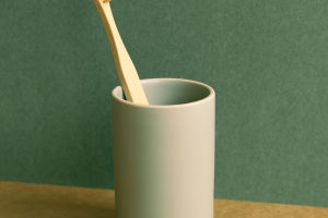
One of the most prominent trends in color psychology is the increasing incorporation of biophilic design principles, which focus on connecting occupants with nature. This approach emphasizes the use of nature-inspired colors, such as earthy browns, lush greens, and sky blues.
These colors are believed to evoke a sense of calm and well-being by mimicking the natural environment. Green, in particular, is associated with growth, renewal, and tranquility, making it a popular choice for living rooms and bedrooms.
This trend reflects a broader desire to create home environments that foster relaxation and reduce stress.
2. Warm Neutrals for Comfort and Versatility
Warm neutrals, such as beige, taupe, and soft grays, are becoming increasingly popular as they provide a versatile backdrop that can complement a wide range of design styles.
These colors are chosen not just for their aesthetic appeal but also for their psychological benefits. Warm neutrals create a sense of comfort and coziness, making spaces feel inviting and safe.
They also allow for flexibility in design, as they can be easily paired with more vibrant accent colors without overwhelming the senses.
The use of warm neutrals aligns with the trend of creating sanctuary-like spaces within the home, where individuals can retreat from the stresses of the outside world.
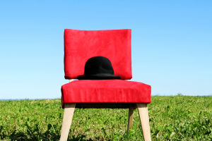
3. Bold Accent Colors for Emotional Impact
While neutrals dominate many color schemes, there is also a growing trend toward incorporating bold accent colors to create emotional impact. Colors like deep navy, rich burgundy, and vibrant mustard yellow are being used to add personality and energy to spaces.
These colors are often applied in smaller doses—such as on a feature wall, in furniture, or through accessories—so that they can energize a room without overpowering it.
The psychological effect of bold accent colors is significant, as they can evoke a range of emotions, from the warmth and optimism of yellow to the confidence and sophistication of navy blue.
4. Soft Pastels for Calm and Serenity
Soft pastel colors, including pale pinks, light blues, and soft lavenders, are increasingly being used to create serene and soothing environments. These colors are particularly popular in bedrooms, bathrooms, and nurseries, where a calming atmosphere is desired.
The psychology behind soft pastels lies in their ability to reduce anxiety and promote relaxation. Unlike the more intense emotions elicited by bold colors, pastels create a sense of peace and balance, making them ideal for spaces where tranquility is a priority.
The use of pastels is also part of a larger trend toward minimalism and simplicity in home design, where less is more, and every element is carefully chosen to create a harmonious environment.