With the improvement of people's living standards today, the requirements for home decoration are becoming increasingly higher.
When decorating a house, it's crucial to use different colors properly. Using intense colors can make people feel irritable and affect their mental health.
Therefore, understanding the basic principles of color matching when decorating a house is of great significance. Here are some guidelines on color matching when decorating a house.
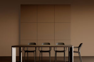
1. Avoid using isometric black and white
While a black and white room might look modern and is preferred by some fashionable people, it can be too intense if used throughout a room.
Staying in this environment for an extended period can make you feel dazzled, nervous, and irritable. It's best to use white as the main color, partially embellished with other colors, to make the space bright and relaxing.
2. Purple can give the space a sense of oppression
Purple may seem quiet, fragile, and slender, evoking infinite romantic associations. People who pursue fashion tend to respect purple.
However, using large areas of purple can darken the overall tone of a space and create a sense of depression.
Therefore, it's not recommended for living rooms or children's rooms where a cheerful atmosphere is needed as it can give a sense of helplessness.
If you really like purple, use it as a decorative highlight in parts of the room, such as a corner of the bedroom or a small area such as a bathroom curtain.
3. Pink can cause irritability
Using large quantities of pink tends to make people irritable. Some newlyweds like to use pink to create a romantic atmosphere in their new home.
However, heavy pink will keep people in a state of hyperactivity. People living in such an environment will have an inexplicable fire in their hearts and will tend to quarrel and irritate.
It's advisable to use pink as an accent for interior decorations or to dilute the concentration of the color. A light pink wall or wallpaper can make a room warm and welcoming.
4. Red shouldn't be used as the main color for a long time
Red also stands for passionate and exuberant feelings. However, using too much red in a room can overload the eyes and create a dizzy feeling.
Even for newlyweds, the room should not be decorated in the main tone of red for a long time. It's recommended to choose red soft decorations such as curtains, bedding, cushion bags, etc., combined with light beige or fresh white.
In this way, the room can refresh people and better highlight the festive atmosphere of red.
In summary, when decorating a house, it's essential to use colors properly to create a relaxing and welcoming atmosphere.
Avoid using intense colors, such as isometric black and white, large areas of purple, and heavy pink. Instead, use them as accents or dilute the concentration of the color.
If you want to use red, soft decorations combined with light beige or fresh white can create a festive atmosphere. By following these guidelines, you can create a comfortable and harmonious living space.